Douglas
House
The
Exterior
In the field of architecture, some designers treat every new project as a tabula rasa – a blank slate – beginning anew without precedent or common language.
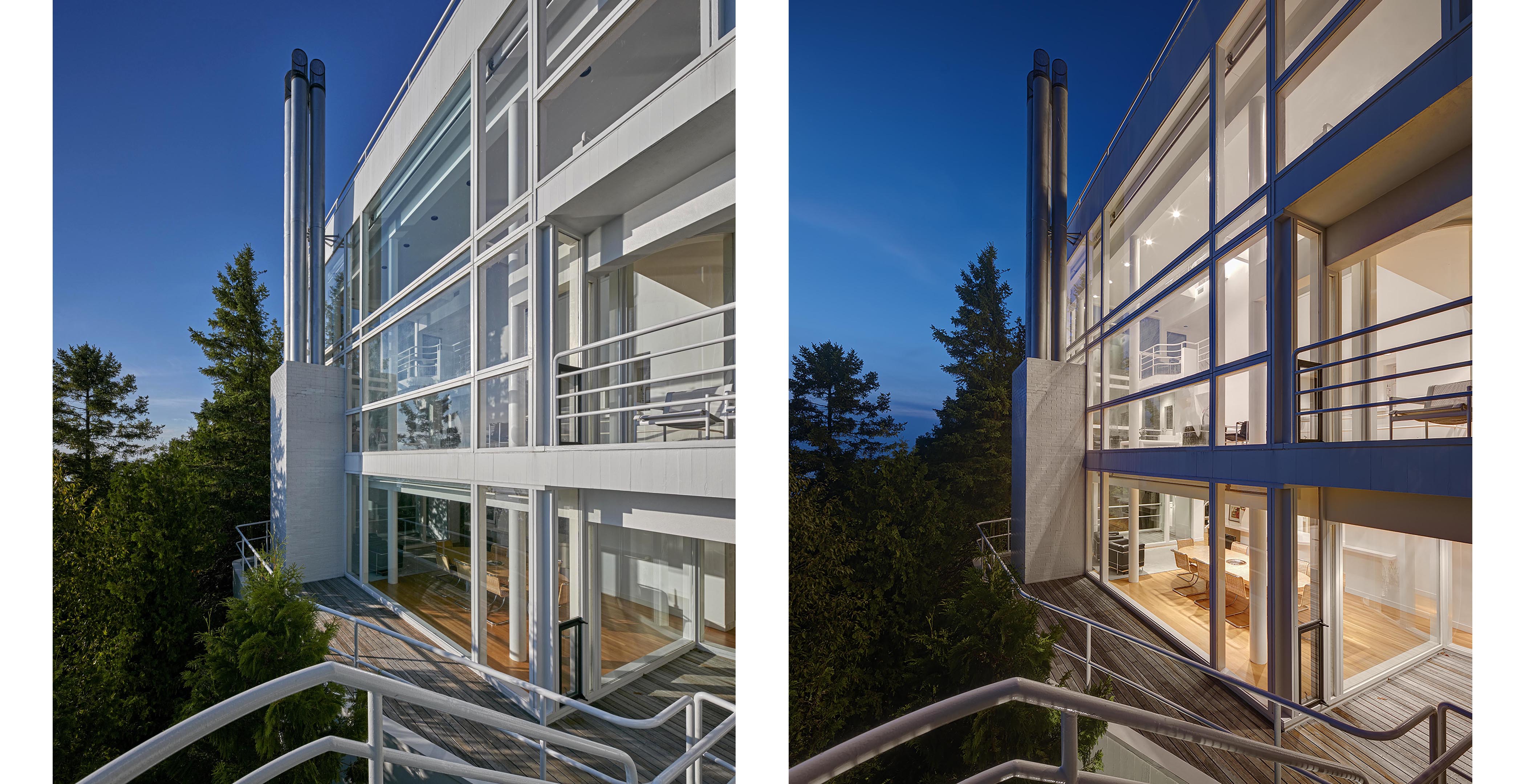
But early in his career, Richard Meier essentially drew a theoretical circle in the sand, and dedicated his work primarily to whiteness, opacity, transparency, and glass.
In the years that followed, the architect has pursued those elements relentlessly, earning criticism from some, but high praise from others. “I think it’s very admirable that he did that,” says architect Frank Harmon, who worked in Meier’s office in the 1970s.
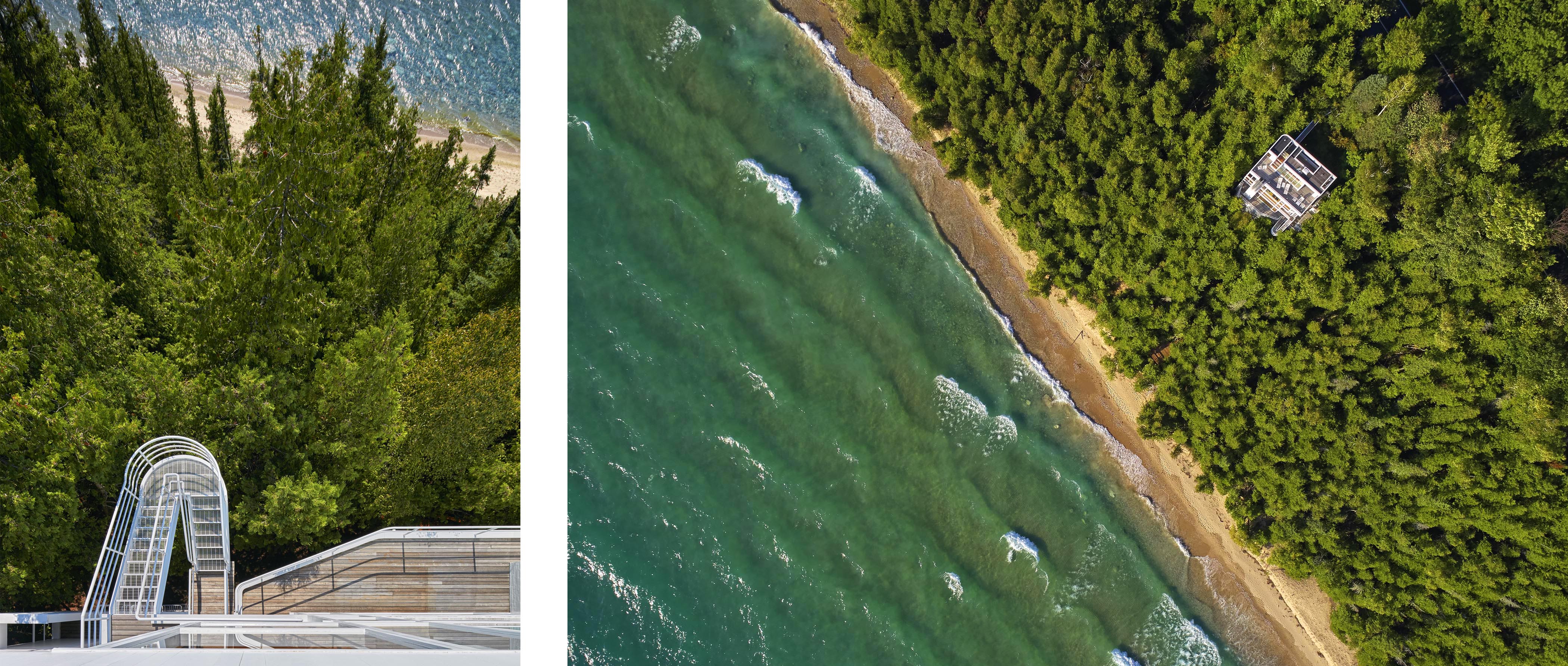
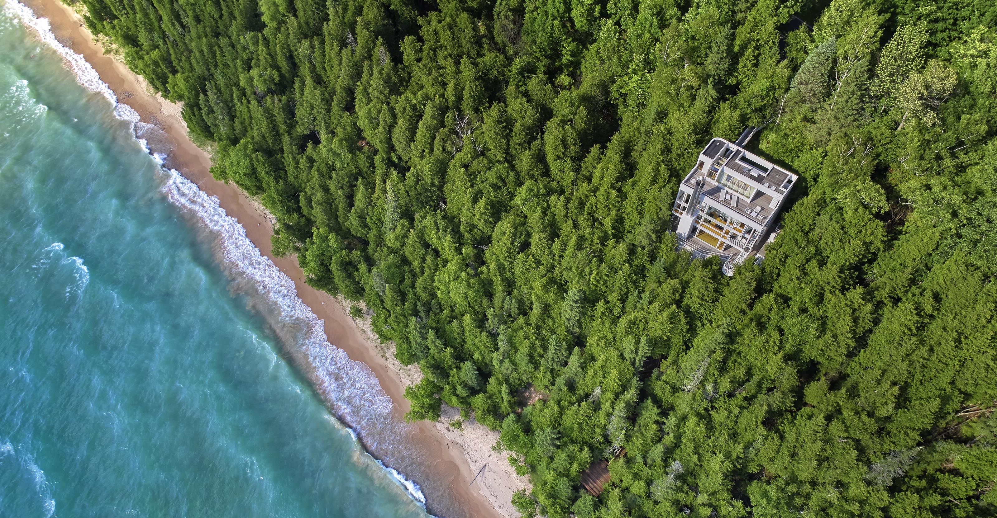
At the Douglas House, Meier blended all four elements masterfully on the home’s exterior – for good reason. “I wanted it to be open with views of this great site looking out to the water,” he says. “And I wanted a way to go from the house, down the stairs, and down a path to the beach.”

The design had evolved before project architect Tod Williams arrived on site, alone, in the summer of 1972. Meier’s philosophy was on his mind. “I was thinking about the challenges and opportunities we found on site, but I was also trying to imagine what Richard would want to do,” Williams says.
And he did. Its white-painted wood and glazed exterior owes much to Meier’s Smith House on the Connecticut coast – as does its relationship of opacity to transparency. “In his early buildings, Meier basically used the same building plan – they’re opaque for one-third, and glass for two-thirds,” architect Frank Harmon says. “It was a very workable strategy.”

The exterior stairway at the Douglas House is an integral part of the home’s design, cantilevering out and over a precipitous landscape. The stair’s handrails are meticulously crafted, following Mies van der Rohe’s well-known precedent of stairs and railings at the Illinois Institute of Technology School of Architecture in Chicago.
"Mies and Meier’s designs created a splined and continuous curved design that followed the movement of a person climbing or descending the stairs," architect Henry Smith-Miller says. "The trick lay in offsetting the stair’s treads."
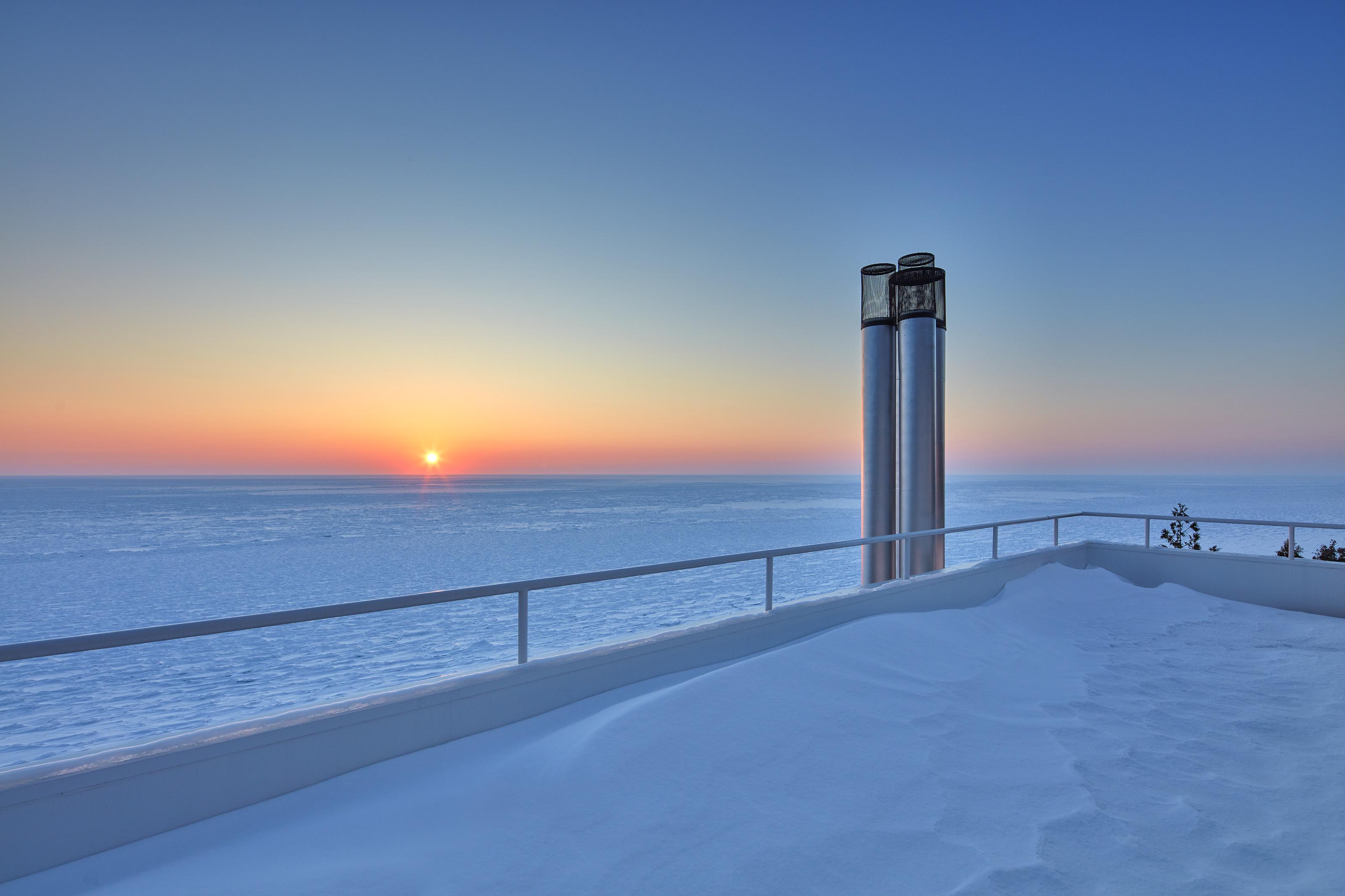
But Meier wanted the exterior of his house to be photogenic, too. “In the design phase of all his buildings, he thought about how they would be photographed,” Harmon explains. “He was a master at marketing – every project had photo angles built into it.”
Today, the Douglas House is a work of art from every perspective – even from above.

